- HOME
- Podcast
-
EPISODES
-
SEASON FIVE
>
- (#054) Missed Income on Holiday? With Krista Dicks, RMT
- (#055) What if I Did The Opposite for 48 Hours? With Krista Dicks, RMT
- (#056) What Do I Spend a Silly Amount of Money On? How Might I Scratch My Own Itch? With Krista Dicks, RMT
- (#057) What would I do/have/be if I had $10 million? What’s my real TMI? With Krista Dicks, RMT
- (#058) What are the worst things that could happen? Could I get back here? With Krista Dicks, RMT
- (#063) Go with the Flow and Sync Your Schedule with Samantha Storozuk, RMT
- (#064) What If I Created My Own Real World MBA?
- (#065) Do I Have to Make It Back The Way I Lost it?
- (#066) What If I Could Only Subtract To Solve Problems?
- (#067) What might I put in place to allow me to go off the grid for 4 to 8 weeks, with no phone or email?
- (#068) How To Build a Mobile Massage Practice with Melissa Pierson, RMT
- (#069) How To Give Yourself Vacation Pay as a Self-Employed Massage Therapist with Emilie McKay, RMT and RMTpreneur
- (#078) Just Take The Jump: Natsumi Lanzoni, MT, Spa Owner
- (#081) CBD As Self Care; Massage Therapist and Client with Kumi Taylor, LMT
- (#083) Hope For The Best But Then Plan For The Worst with Thomas Thorne, Investment and Insurance Broker
- (#085) Planning For Pregnancy And Beyond With Emilie McKay, RMT and Kelly Salvador, RMT.
- (#089) Trust Your Gut. Nancy Pitre, RMT, Certified Holistic Health Coach, Certified Gut Health Practitioner
- (#91) Money Nuts and Bolts for Therapists in Private Practice with Linzy Bonham
- (#93) Hiring A Website Designer As An Act Of Self-Care For Massage Therapists with Trevor Chisman "The Massage Rebel," Massage Therapist, Clinic Owner, Website Designer
- (#95) Navigating Post-Surgical Recovery with Lymphedema Therapy with Natalie Schwartz, RMT
- (#97) Court-Side Care: The Medical Team Behind The Toronto Raptors with Melissa Doldron, RMT and Movement Educator
- (#99) From Burnout to Breakthroughs with Conor Collins, RMT, Instructor, Host of "The Concast" Podcast
- (#100) Radical Conversations: Celebrating 100 Episodes with Mark and Amanda from 2 Massage Therapists and a Microphone
- (#102) Quantum Touch Therapy with Thea Willette
-
SEASON FOUR
>
- (#041) Dr. Tiffany Ryan, Co-Founder of Yomassage®: Touch. Stretch. Breathe.
- (#043) Aubrey Gowing. Strategies for Self-Care
- (#044) Navjit Kaur Sidhu: What Keeps You Going and Keeps You Giving?
- (#045) Taking Your Hands-On Skills Online with Elle Browning
- (#046) How to Provide Long Term Patient Results with Joanna Sapir
- (#047) Should You Take Courses Your First Year In Massage Practice?
- (#048) How Your Space Impacts Your Success with Carolyn Boldt
- (#049) If I Was Starting Over With Krista Dicks
- (#050) Working Abroad as a Massage Therapist With Krista Dicks, RMT
- (#051) Scaling Up to Scale Back with Darryl "DJ" Turner
- (#052) How Embodiment Coaching Can Help You Prioritize Your Mental Health with Helene Letourneau
- (#053) Confessions of a Massage Table with Krista Wright, RMT
-
SEASON THREE
>
- Bro, Do You Even Refer Out?: Krista Dicks, RMT
- When Was The Last Time You Said Thank You?: Krista Dicks, RMT
- (#031) The Pain Free Massage Therapist. Mark Liskey
- (#032) Massage Champions. Elicia Crook.
- (#033) Kelren Mello. Massage From The Heart
- (#034) Official World Online Massage Championship
- (#035) Mistakes as Creative Stepping Stones: Jessica Oliver
- (#036) Holistic Connection: Chris Delos Reyes, RMT
- Goal Setting: Krista Dicks, RMT
- A Tip for Getting Along With Someone You Don't Like: Krista Dicks, RMT
- (#037) Effective Networking: Emilie McKay, RMT, Business Coach
- 3 Ways To Maintain Your Authority In A Massage Treatment: Krista Dicks, RMT
- (#038) Yvonne Moir, RMT, Professional Musician, Co-Owner of Origin Wellness
- (#039) Pure Advice on Raising Rates: Samantha Hughes, RMT, Co-owner Pure Massage and Holistic Therapies
- (#040) How Can We Advocate For Massage Therapy?: Don Dillon, RMT
-
SEASON TWO
>
- (#030) Randi Kay, Massage Therapist
- Batch Tasks. Save Time: Krista Dicks, RMT
- (#029) Jamie Boer, RMT
- (#028) Karen Munro-Caple, RMT
- (#027) Nicole Andrews, RMT & Heather Rivers, RMT
- (#026) Zephyr Samchuck, RMT
- (#025) Shawn Markwick, RMT
- (#024) Megan Hoskins, RMT
- (#023) Kat Pugliese, RMT
- (#022) Ian Kamm, RMT
- (#021) Annie Milović, Balance
- (#020) Marty Royal, UK Pro Sports Massage Therapist
- (#019) Emily Burns, RMT
- (#018) Scott Grisewood, RMT
- (#017) Sandra Rosten, Massage Therapist
- (#016) Richard J. Platt. Massage Business Success Coach
-
SEASON ONE
>
- (#015) Livia Pellerin
- (#014) Nathan Walton
- (#013) Chelsea St. Denis
- (#012) ANDREE-ANNE RUSAW
- (#011) KATHLEEN DE JESUS-GAUTHIER
- (#010) HELENE LETOURNEAU
- (#009) DR. MELANIE STEWART
- (#008) KELLY SALVADOR
- (#007) ARLENE KEITH
- (#006) JANA VELTHEIM
- (#005) KAREN BUCHANAN-SAUVE
- (#004) DOM LABRE
- (#003) AVI DAVIES
- (#002) HUGUETTE LONG
- (#001) KARINA JOLY
-
SEASON FIVE
>
- Resources
- SEARCH
|
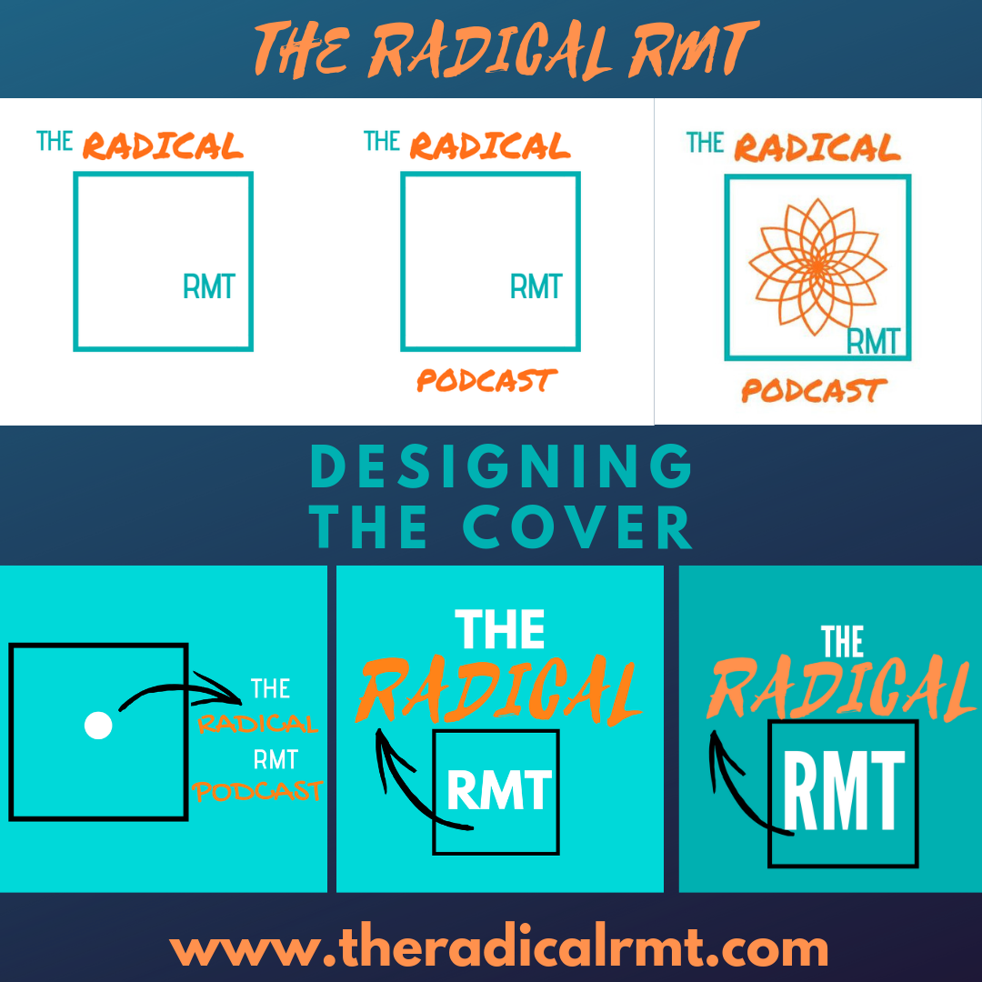
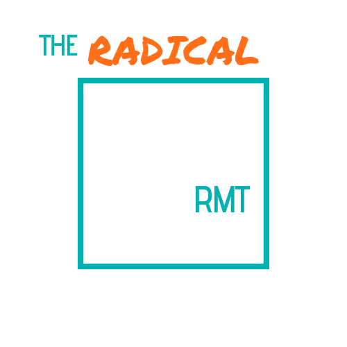
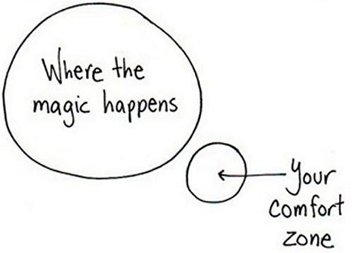
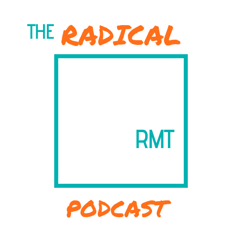
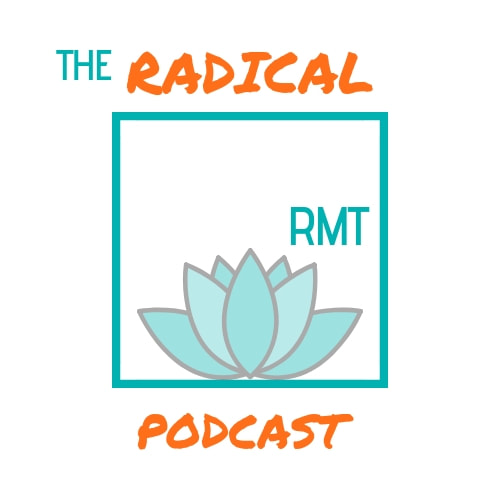
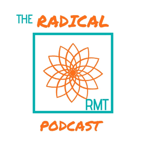
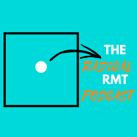
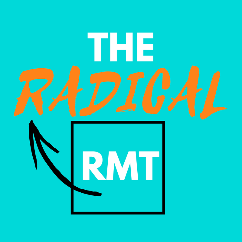
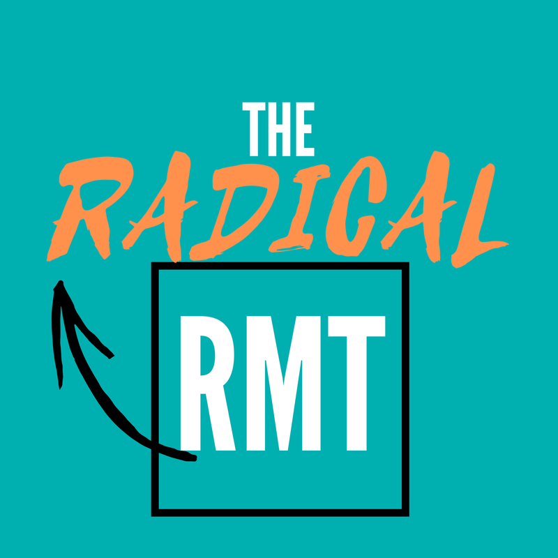
When I am asked what I do for "fun" or what one of my hobbies are, I honestly can't come up with one that most people can relate to or is "cool"- I just enjoy having a project and the process of creating to make it a reality. My husband and I refer to it as "tapping" because most of these projects and "creating" happen on my laptop. I have no experience in graphic design and I have yet to grasp coding (though I have taken courses with the amazing #Ladieslearningcode). For the podcast, I felt that this early in the game I could get the basics started and if it needs some professional help along the way I would be happy source it out. These elements of the podcast; the website, the logo, the podcast cover, the facebook posts, the instagram posts etc. take up my free time to create but, right now I enjoy it and continue to have a million ideas of how it might evolve. I hope that this post will be a reminder that you don't have to be creative or tech savvy to just start working on your idea. If I have learned anything from this whole podcast experience it is that you have to be open to the process. It is an example of accepting that your original idea will be terrible at the beginning but, through growth and a willingness to learn, it will become something you are proud of for simply trying! Most people are not even willing to try for fear of not looking perfect or as an expert. It is an impossible expectation because, when you learn something new it can't be perfect or look good at the same time! Check out the evolution of the cover design for The Radical RMT... Each logo was created in CANVA WHERE THE MAGIC HAPPENS...The Main idea I wanted to represent was from the classic example we all know that "just outside your comfort zone is where the magic happens." The RMT in the box representing your comfort zone and the word "Radical" representing "where the magic happens." Radical RMTs are definitely living "outside the box." Originally I didn't put the word "podcast" in the logo design as I knew the logo could be used to represent branding which could extend beyond the podcast. The colours were chosen based on orange representing creativity and joy and a complementary turquoise colour found with the adobe color wheel. I'm not surprised I was drawn to the turquoise as it brings back memories of my own Radical RMT experience living and working in the Turks and Caicos Islands. AVOID JUST FILLING THE SPACEThen came the addition of the Lotus flower or some variation. When I showed the logo to my husband, he suggested there should be something "massage-y" in the box and that it looked too plain. Fair enough, it did look a bit empty. Upon searching for massage images that were neutral to the cause, all I came up with was the lotus flower. However, it didn't really suit the "radical" side of the podcast. BOLD COLOURS AND A CLEAR MESSAGENow, we are starting to get somewhere! Taking a look at podcast cover designs that stood out, the characteristics were bold colours and eye catching design. The cover layout filled the entire space effectively, it was simple and it was also very obvious what the podcast was about, even if it was only with words or an image alone. Going back to the original idea of "where the magic happens" I made changes based on the above observations and I was way more happy with the result. I felt it shared the right message and it represented the listener I wanted to attract. The Font is "Selima" and "League Spartan." Why? Because I liked how Selima looked as "Radical" and then I google searched the best font pairings that go with Selima. See, if I can do it, you can do it! THE LATEST RESULTThe current design is a result of my first meeting with JP Davidson of Pop-Up Podcasting. JP has provided guidance on the entire process of podcasting and his help has been invaluable! If you have been thinking of starting a podcast but, you are scared of the tech side or not sure how to get started- JP is your guy! When it came to the cover design, he gave his feedback on the designs I had completed and the one that worked best, he suggested to make the text bigger, the proper dimensions to use, and also to remove the word "podcast" from the title as it was obvious since people would find it on a podcast platform. I darkened the turquoise colour so that the text would be more legible and voila, I now have the latest cover design! WHAT DO YOU THINK?So what do you think of the whole cover design process?
What do you think of the latest cover design for The Radical RMT? Do you have any suggestions for creating an eye catching cover design? Are you having any challenges creating your own cover design? I would love to try and help! [email protected]
1 Comment
|
Krista Dicks, B.A.Massage Therapist Archives
February 2020
Categories |
 RSS Feed